Bold murals. Luxe prints. Curated themes. Designer-tips. Your space reset starts here
One of the most common things we often hear from homeowners is,
“My décor isn’t bad… but it just doesn’t feel like me anymore.”
Sounds familiar, right?
Sometimes it’s a wall you have grown tired of, or a corner that feels flat. Sometimes it’s not even the visible clutter—it’s emotional. Isn’t it?
You have changed. Your space hasn’t.
But the good news? You don’t need to start from scratch. You just need to mix, match, and play with wallpapers the way designers do—with passion and clarity.
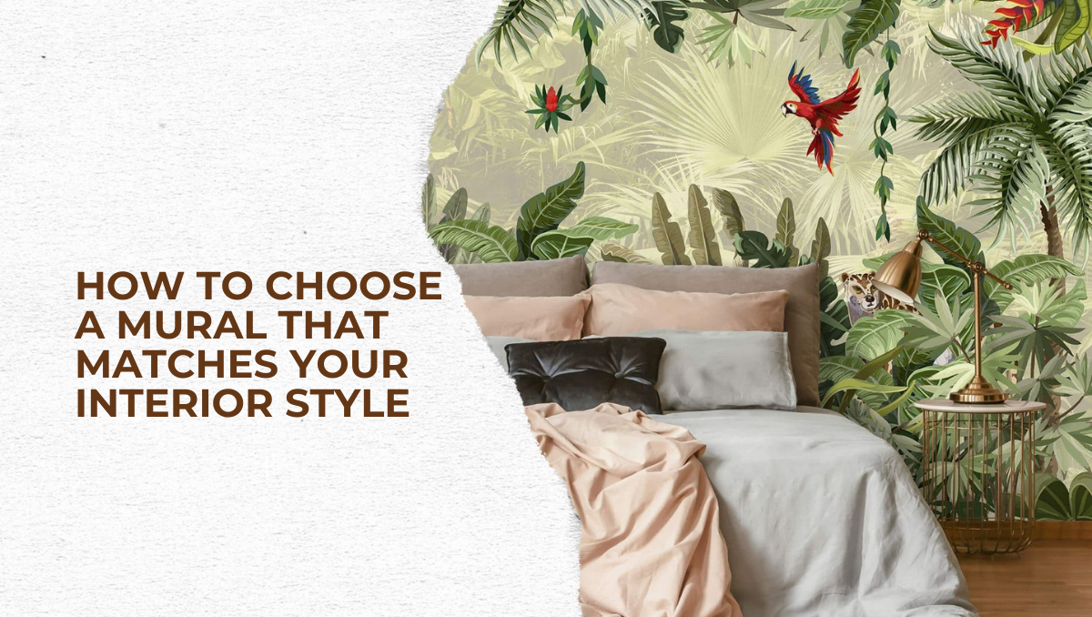
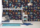
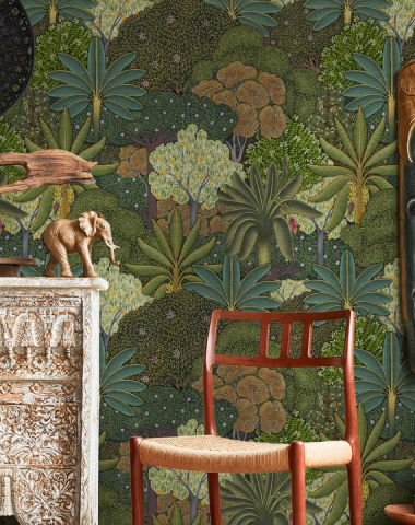
If you have been eyeing that bold and beautiful wallpaper mural on Magicdecor website but aren’t sure how it fits in with your beige sofa and rattan chairs, don’t worry. It can be seamlessly integrated into your existing décor. We’ll show you how.
Getting to Know the Home You Already Have
Before you start browsing swatches or saving pins, pause. Take a walk around your home. Check what’s working. Does something feel off? Make a list of what brings you joy and what doesn’t.
Great interior decor doesn’t always mean starting over. Sometimes it can mean building on the groundwork you have already done.
If you are not sure where your interiors stand, here’s a simple visual guide to help you identify your current style.
Quick Guide: How to Identify Your Home’s Style
- Modern: Clean-lined furniture, neutral palettes, sleek finishes
- Boho: Layered textures, collected pieces, plants and patterns
- Industrial: Raw edges, metal accents, wood + concrete combos
- Traditional: Rich woods, symmetry, classic carvings and curves
You don’t need to fit into one perfect box. Most homes blend styles—that’s completely normal. Your goal is to spot the dominant theme so you can choose wallpaper decor that compliments it.
Do a quick color audit
Ask yourself:
- Are your current tones more warm (terracotta, taupe, mustard) or cool (greys, blues, sage)?
- Do you lean into neutrals, or love a bold pop here and there?
Your wallpaper should either complement or artfully contrast this palette, not fight with it.
Assess the furniture you own
Your furniture is central to your room’s personality. Before introducing a wallpaper, take a moment to observe the textures, tones, and proportions already present.
Take stock of:
- The weight and tone of your key furniture pieces
- Any metal accents (gold, chrome, copper)
- What’s the color of your furniture? Wood finish, Ivory or Ebony
- The overall texture: Are you working with soft linens, velvets, rattan, or leather?
- What era or vibe does the furniture give off—vintage, rustic or modern?
This quick audit will steer you toward choosing wallpaper designs that enhance and not overpower your existing interior decor.
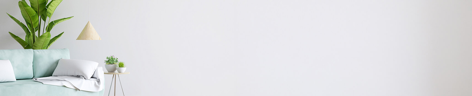
Your designs on your walls
Upload any image to order wall mural prints online
Pairing Wallpaper with Your Décor Style
Now that you have done the audit—taken stock of your color palette, and mapped your furniture—you are ready to consider wallpaper designs that feel like they belong.
Remember: design and décor are a language, not just visuals. A wallpaper works best when it speaks the same language as your furniture and finishes.
So choose patterns and textures that complement—not compete with—what’s already there.
Here’s how to pair a wallpaper like it was always meant to be there:
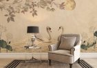
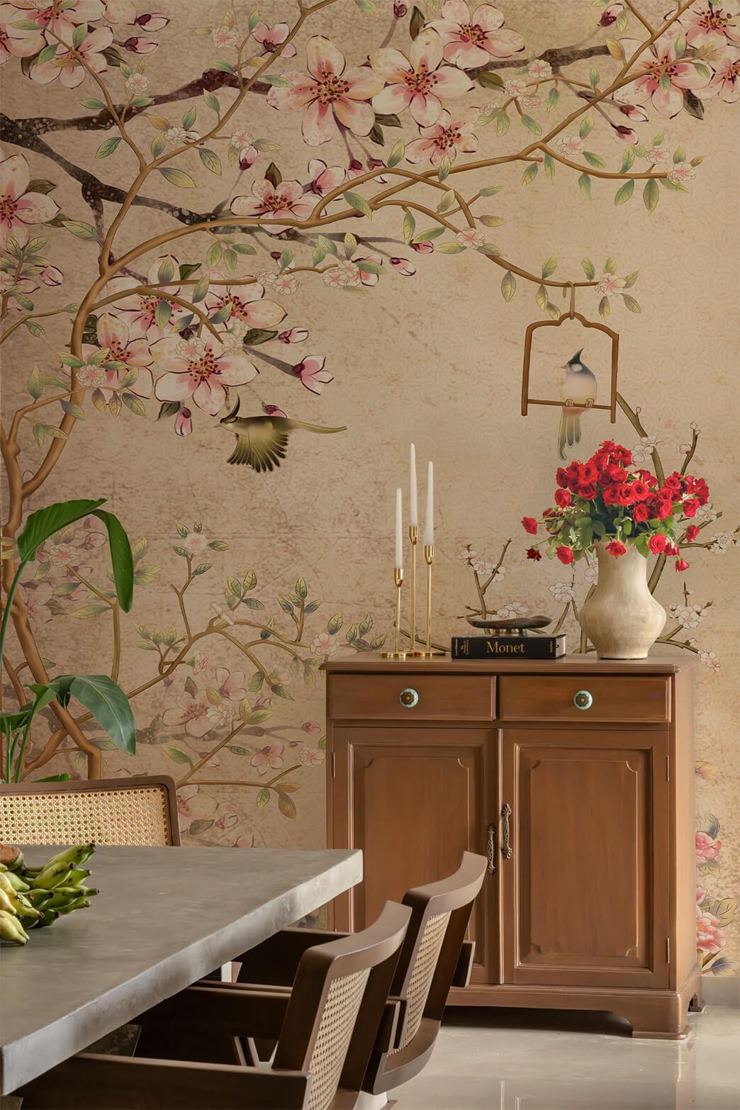
- If your furniture is vintage or antique: Choose floral or botanical patterns that blend with old-world charm and soften the visual weight of classic woods and brass.
- If your palette is minimalist and your furniture clean-lined: Go for geometric prints in muted tones—this creates structure without adding clutter.
- If your space is eclectic with mixed finishes: Watercolor-style wallpapers layer beautifully, adding flow to a space that already has personality.
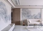
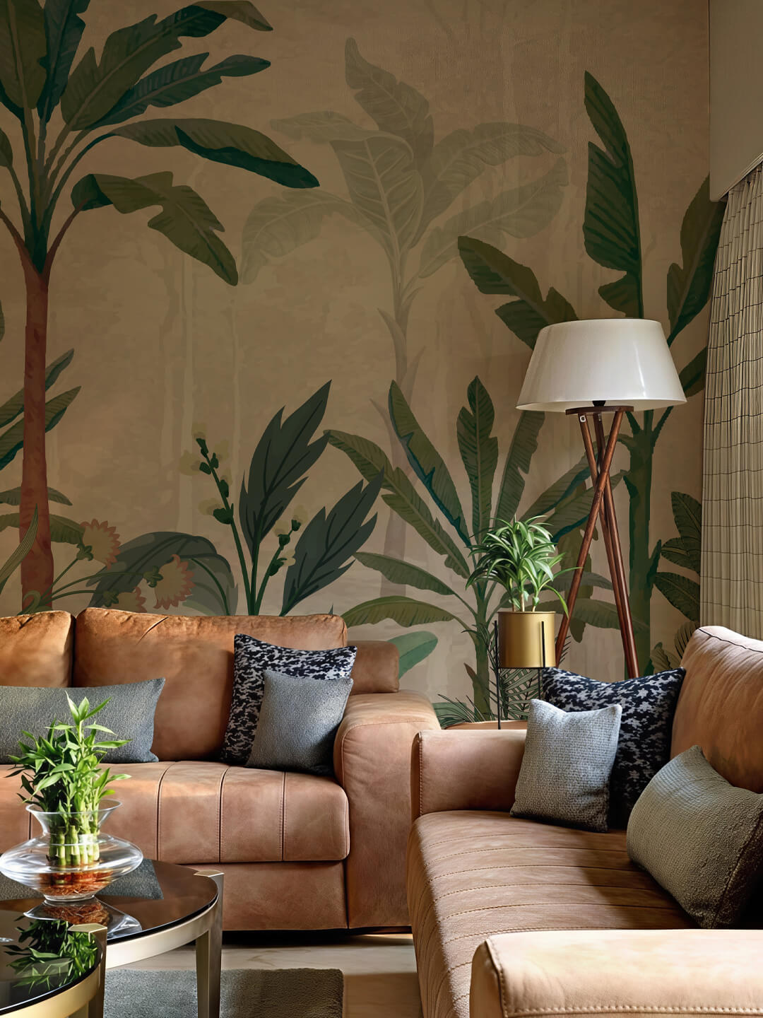
- If your room feels rigid or cold due to sharp layouts or metals: Bring in textured wallpapers like grasscloth or linen weaves that add warmth, tactility, and balance.
Always test your wallpaper sample in natural outdoor light and the lighting you use at home. Hold it against your main furniture pieces—your sofa, headboard, and dining chairs. This step helps you see how colors look and feel when you use them in your home.
Mixing Patterns and Prints like a Pro
A pattern brings soul to your space—but add too many, and it’s chaos. The solution? Balance.
Follow the rule of three
To avoid chaos, stick to three categories when combining patterns:
- Base: A dominant pattern (e.g., a bold mural or floral wallpaper)
- Accent: A secondary, smaller-scale pattern (like a geometric rug or pillow)
- Texture: A visual or tactile neutral (linen, rattan, velvet) that calms the eye
Smart pairings that don’t go wrong
Some combinations might seem unexpected at first, but in the hands of a keen eye, they create balance, depth, and beauty. Here are timeless wallpaper decor pairings that designers love:
- Florals + Stripes: A classic mix that adds playful elegance. The softness of florals pairs beautifully with a hint of structure or stripes, especially in bedrooms or reading nooks.
- Solids + Abstracts: If your space already has a bold abstract wallpaper, keep furnishings in solid tones to ground the visual energy. This allows one element to shine while the other provides support.
- Traditional Prints + Modern Furniture: Don’t shy away from contrast. A vintage-style wallpaper can add charm and richness to minimalist or modern spaces if tied together with a shared color story.
- Muted Patterns + Natural Textures: Earth-toned wallpapers (like clay, sage, or sand) pair effortlessly with rattan, cane, or linen. This is ideal for a boho-meets-coastal vibe.
Avoid visual clutter
Every room needs a focal point—and just as importantly, it needs space to breathe. Negative space isn’t empty; it’s much needed. It gives your existing décor to unfold and quietly hold attention.
- If your wallpaper is bold, let the surrounding elements be subdued.
- If your furniture features strong patterns or textures, balance it out with simpler wall treatments.
- If your floor is visually striking with patterns or decorative tiles, use wallpapers in light shades.
Visual Calm = Luxury. That’s the real designer’s secret.
Create Color Harmony—Not Chaos
The right wallpaper ties your entire color palette together—from the walls to the smallest accent. Whether you lean towards on-tone or love bold contrasts, color harmony can transform your space from ordinary to magnificent.
Subscribe to Save 5%
All subscribers get an additional 5% OFF on their first order

The key lies in understanding how different colors interact with each other. And that starts with the color wheel. This classic design tool helps you understand the color scheme.
Understand the color wheel to build your palette:
- Complementary colors: Opposites on the wheel (e.g., navy and rust) for bold contrast.
- Analogous colors: Neighbours on the wheel (e.g., sage, olive, and forest green) for a cohesive, calming effect.
- Triadic colors: This scheme consists of any three colors that are at an equal distance on the color wheel. They make a triangle across the wheel and are excellent for creating a vibrant look. The most common triadic color schemes are red, blue and yellow. You can create your palette in different triadic tones.
Tone and contrast can change everything—from the energy in your room to how expansive it feels.
Here’s how to play with both:
- For a soft, layered look: Stick to tone variations—different shades and tints of the same base color, like sand, taupe, and walnut. This creates a calming, cohesive atmosphere.
- For high-impact energy: Pair contrasting hues like navy and terracotta to create bold drama, but balance it with neutrals to avoid visual overwhelm.
Designer’s Tip: Always test how your chosen colors behave in natural and artificial lighting. Some tones may feel cooler or warmer depending on the time of day.
Mood Examples:
- Tonal: Ideal for bedrooms, reading corners, or meditation spaces.
- Contrasting: Works great in dining areas, accent walls, or creative studios.
Still feeling overwhelmed by color choices? Use Magicdecor’s pre-curated themes—a stress-free way to achieve a polished, cohesive and aesthetically pleasing space without second-guessing.
Accent Wall Secrets Designers Swear By
Make only one wall do all the talking, and everything else will fall into place.
- Choose the right wall: Anchor your mural behind the sofa, bed, or dining space—areas that already command attention. Choose from a wide range of stunning Magicdecor wallpaper murals that resonate with your life.
- Frame it like art: Use wallpaper framing techniques to define the mural—think borders, mouldings, or panel-style layouts.
- Coordinate with meaning: Tie the wallpaper into the space using complementary lamps, rugs, vintage finds, cabinets or plants. This creates an effortless look.
Do More than just Mix and Match: Pour your Heart into it
Great design isn’t about starting over—it’s about knowing what to keep, what to let go, and what feels like you. And you don’t need to be a designer to get it right.
With Magicdecor’s wide range of wallpaper mural designs, curated collections, and expert guidance, mixing and matching becomes effortless—and personal.