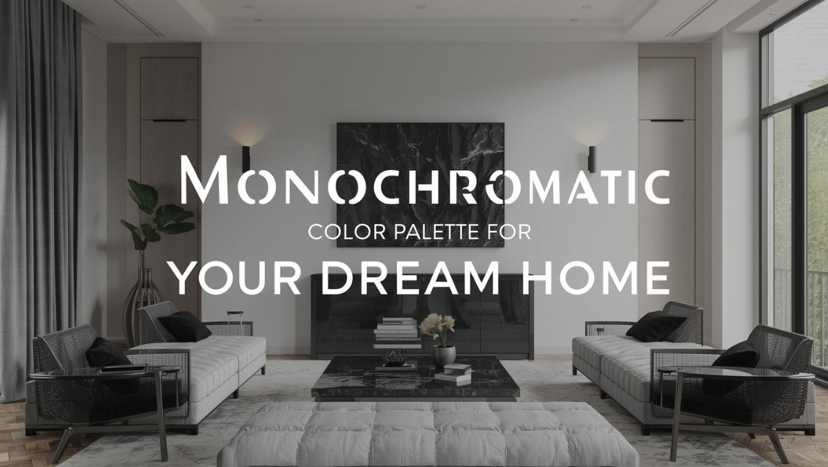
When it comes to home interiors, one of the biggest challenges is choosing the right color palette. Should you go bold? Stick to neutrals? Mix warm and cool tones? The options are endless—and that’s exactly why a monochromatic color palette can be your secret weapon.
It’s not boring. It’s not repetitive. In fact, a well-executed monochromatic scheme can feel layered, luxurious, and oh-so-cohesive. Whether you’re designing a studio apartment or a sprawling villa, this approach can bring harmony, visual balance, and even make your space look bigger.
Let’s break it down, one shade at a time.
What Is a Monochromatic Color Palette?
A monochromatic color palette uses variations of a single base color. This includes:
- Tints (color + white)
- Shades (color + black)
- Tones (color + grey)
For example, if your base color is blue, you might pair soft baby blue, classic navy, muted slate, and icy sky tones all in one room. It’s still all blue—but the range adds dimension without visual clutter.
Why Choose Monochrome for Your Home?
Monochrome isn’t just an aesthetic—it’s a design philosophy. Here’s why homeowners and designers love it:
1. Creates a Clean, Sophisticated Look
By sticking to one family of color, you naturally reduce visual noise. Everything looks intentional, calm, and polished.
2. Easy to Experiment With Textures and Finishes
Since you’re limiting your color range, you can go bold with texture. Think velvet sofas, matte walls, glossy cabinets, raw concrete, or wood grains—all in similar tones. It keeps things interesting without feeling chaotic.
3. Great for Small Spaces
A monochromatic palette can visually expand a room. When walls, furnishings, and decor fall into the same color family, your eye flows continuously through the space—making it feel more open.
Your designs on your walls
Upload any image to order wall mural prints online
4. Timeless Appeal
Trends come and go, but tonal rooms age well. Whether it’s an earthy terracotta scheme or a greyscale palette, monochrome has staying power.
How to Use a Monochromatic Palette at Home

Here’s how to translate this elegant concept into real rooms without making them feel flat or “matchy-matchy.”
Living Room
Opt for a calming base—like beige, taupe, or sage. Layer it with a deeper wall tone, plush sofas in lighter hues, and wooden or metallic accents in similar undertones. Add textured wallpaper or upholstery to make things pop.
💡 Pro Tip: Use oversized art or a statement coffee table to break the monotony subtly.
Bedroom
Monochrome works wonders in bedrooms because it promotes relaxation. Choose a muted tone—dusty rose, cool grey, seafoam, or even charcoal—and layer linens, curtains, and headboards in varying intensities of the same shade.
💡 Consider: A tone-on-tone wallpaper behind the bed for a seamless accent wall.
Kitchen
Think all-white or all-navy kitchens? Those are monochromatic in action. For added depth, try different finishes: matte cabinetry, glossy subway tiles, brushed gold handles, and stone countertops—all in the same base hue.
💡 Balance it out with lighting: warm pendants or a skylight can prevent the space from feeling cold.
Bathroom
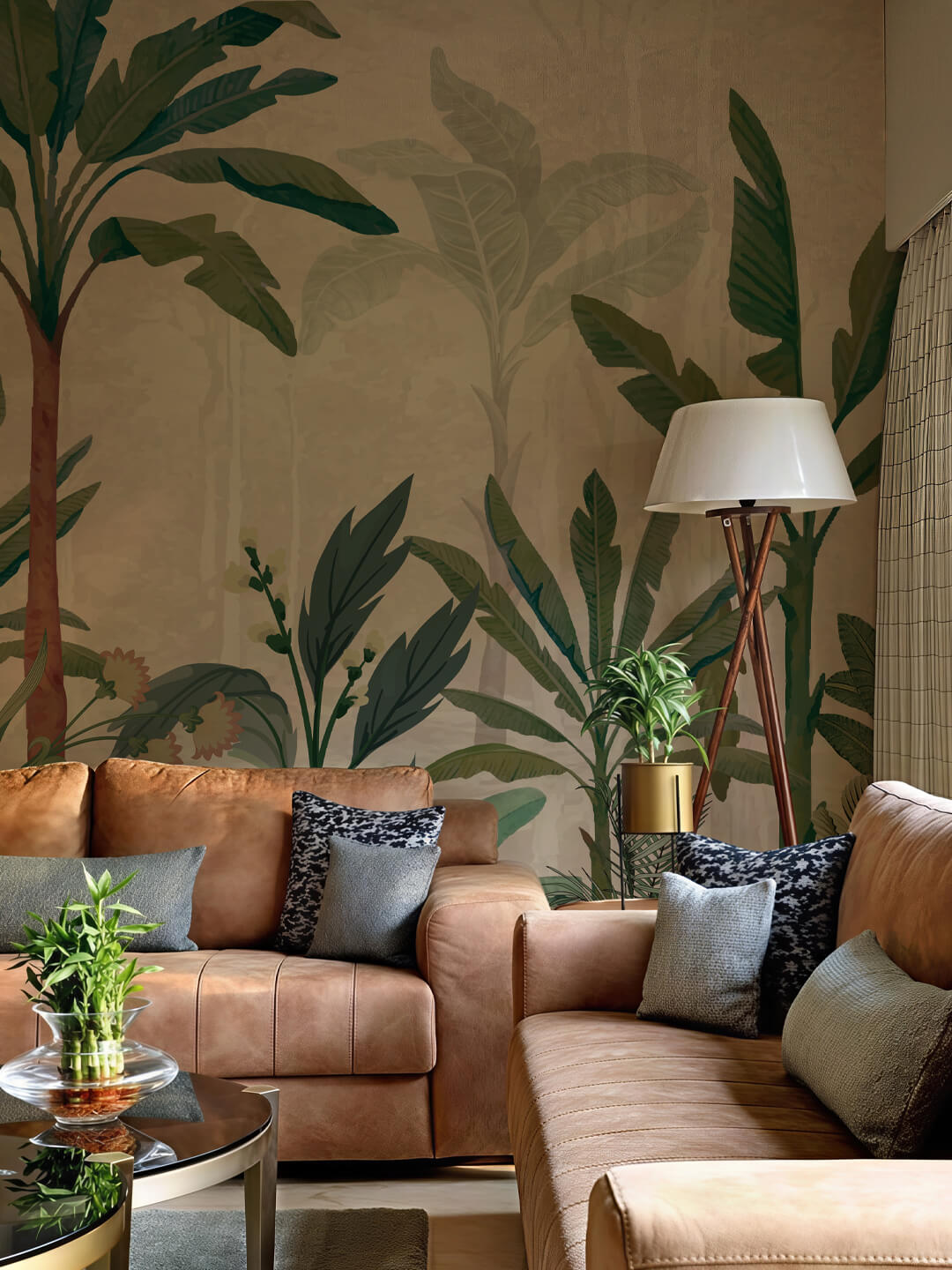
Want a spa-like feel? A monochrome bathroom with light grey tiles, charcoal grout, and metallic silver fixtures looks luxurious yet minimal. Or go the other way with warm sand tones and cream accents.
💡 Wallpaper Tip: Use subtle palm or marble-effect wallpapers in the same shade range to elevate compact spaces.
Adding Personality Without Changing Color
Here’s the magic of monochrome—you can go all-in on personality, mood, and story, even with just one color.
- Use Texture: Linen, rattan, leather, cotton, wool—add layers and the room comes alive.
- Play with Shape: Curved furniture, angular decor, or geometric wallpaper patterns work beautifully when the color doesn’t steal the show.
- Go Tonal with Decor: Candles, vases, books, and rugs can all sit within the palette. This brings balance while letting form and placement shine.
Choosing the Right Color for Your Palette
Start with how you want the room to feel:
Subscribe to Save 5%
All subscribers get an additional 5% OFF on their first order

- Relaxing? Go for greens, neutrals, or blues.
- Energetic? Try coral, mustard, or soft yellows.
- Dramatic? Deep burgundy, forest green, or inky navy deliver mood and elegance.
- Bright and airy? Soft whites, blush, or dove grey are ideal.
And always test a few swatches in different lighting—natural and artificial—before committing.
Wallpaper’s Role in Monochrome Rooms
Wallpaper is a game changer for monochromatic design. It can:
- Add instant texture and dimension
- Act as the anchor in your color story
- Offer subtle patterns without color variation
- Work as a feature wall that ties everything together
Look for wallpapers with embossed effects, metallic hints, marble or geometric prints—all in your chosen palette.
With Magicdecor, for instance, you can find made-to-measure wallpapers in every monochromatic mood—from pastel botanicals to moody murals, all printed on VOC-free, eco-safe paper. And yes, you can customize your own color tone too.
Final Thoughts
A monochromatic color palette isn’t a limitation—it’s a creative challenge. One that leads to refined, calming, and sophisticated interiors. Whether you’re furnishing a compact city apartment or revamping your dream villa, this approach makes styling easy and impactful.
So, pick your favorite shade and build a world around it. From tone-on-tone wallpaper murals to complementary textures, monochrome is minimalism done right—with plenty of room for self-expression.