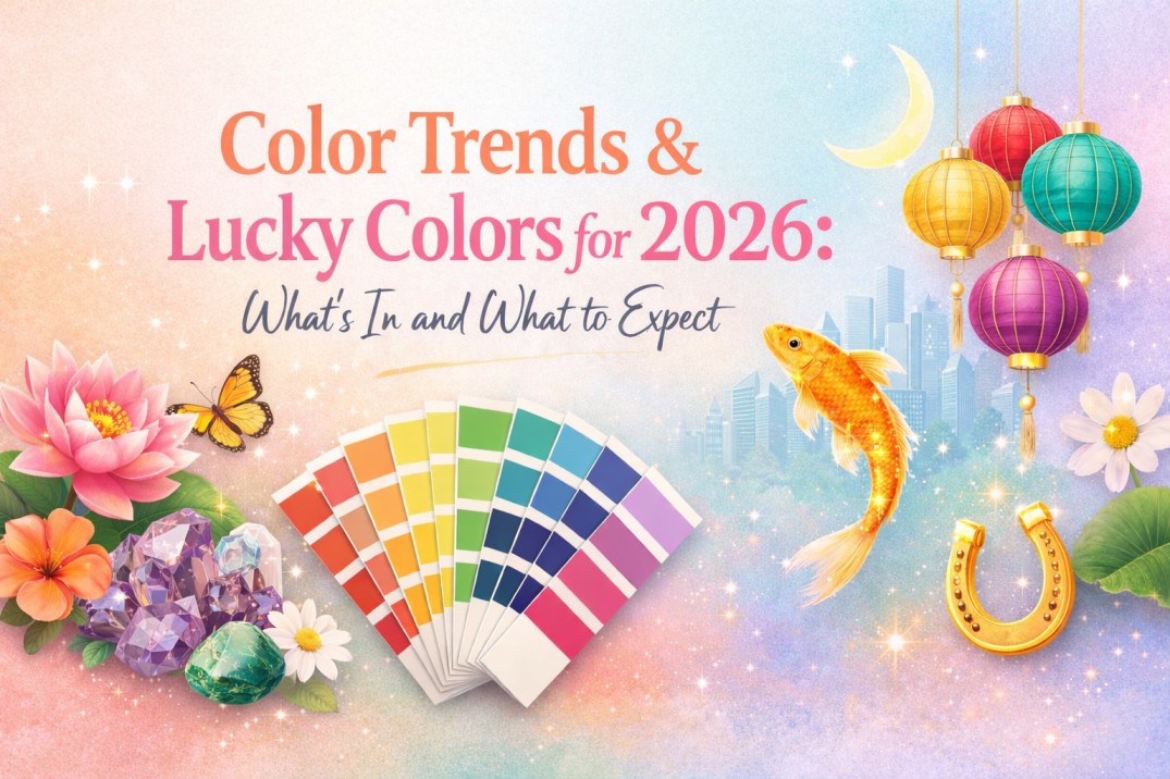
Now that we’re nearing 2026, it already feels like we’re knee-deep in ‘color of the year’ announcements, trend forecasts, and conversations around lucky shades.
From Pantone’s Cloud Dancer, emerging at the trendy color of the year to blue situating itself as the lucky color of 2026, the color palette for the year ahead feels thoughtful rather than overwhelming.
That said, trends and lucky colors aren’t meant to be followed word for word. They work best as guides and inspirations, meant to be used with intention.
If you’re curious to explore which colors are trending, how they translate into different interiors or which colors are going to bring you luck, keep reading this blog.
Why Color Trends Matter in 2026?
Color trends have started long before 2026, often dictating how fashion, interiors, and product design evolve. Here’s why they matter in 2026 as well:
- Mirror Global Lifestyles and Emotions: The colors that are trending in 2026 are shaped by the collective consumer’s desire, allowing us to feel comforted and seen through one shared color.
- Offer Direction in a World of Choices: With many shades available, a trendy color(s) help interior designers, industries, and companies start somewhere and make well-informed decisions that lead a trend.
- Help Create Spaces That Feel Current: Following trends thoughtfully ensures interiors and your lifestyle feel fresh and anew without feeling disconnected from cultural or societal context.
How Color Trends are Predicted?
Every year, the Color Marketing Group (CMG), an international association of color design professionals, discuss, argue, and present predictions on future color trends. The colors of the year are predicted by several factors such as:
1. Global Color Forecasters
Many leading color forecasting organisations like Pantone and Dulux bring together designers, experts, and industry leaders to analyze consumer behavior, seasonal color trends, and cultural shifts before finalizing the color trend.
2. AI-Driven Data and Consumer Desirability Analysis
With the rise of AI, color forecasting has become more data-backed than ever. AI tools now help analyze datasets from trends, social media, online shopping behaviour, and other visual platforms to determine the desirability of specific colors.
3. Trend Mapping Across Various Industries
Color trends are rarely isolated to one sector. Forecasting teams study how color performs in multiple industries such as fashion, beauty, interiors, tech, and lifestyle. When a shade appears consistently, it signifies a long-lasting color trend.
4. Cultural, Social, and Emotional Shifts
Global events, economic conditions, and collective emotions heavily influence color choices. These shifts help color experts anticipate and determine which colors people will gravitate towards next.
What are the Top Global Color Trends for 2026?
The 2026 color palette has a range of colors that are equal parts soothing, expressive, and quietly dramatic, that are here to take over your lifestyle:
1. Earth-Inspired Tones
Earthy hues are already making a strong appearance, subtly setting the foundation for global color trends of 2026. This is so, as a desire to connect with nature and invoke sustainable values.
Examples:
- Olive green
- Terracotta
- Deep burgundy
- Rich Browns
- Moss green
2. Serene Neutrals
Pantone’s color of the year for 2026, Cloud Dancer, a soft and pale white, leads the trend. Although the color has received mixed reactions online, the choice for this shade signals a move toward quiet luxury and minimal visual clutter across many industries.
Examples:
- Cloud dancer
- Icy pastels
- Gentle beiges
3. Vibrant and Warm Tones
Alongside earth-inspired tones, there’s a rising trend for warm, uplifting colors that inject energy and personality. These shades speak to optimism, joy, and emotional warmth, especially as consumers seek more expressive color palettes.
Your designs on your walls
Upload any image to order wall mural prints online
Examples:
- Banana yellow
- Tangerine disco
- Electric fuchsia
4. Deep and Rich Hues
Rich, deep, saturated colors that evoke luxury and tranquility are gaining ground as designers balance light neutrals with tones that have presence and emotional weight. These colors are perfect in providing contrast and elegance.
Examples:
- Transformative teal
- Deep burgundy and plum
- Rich browns and chocolates
- Moody greens
Color Trends vs Lucky Colors: What’s the Difference?
Want to know more about what’s the difference between color trends and lucky colors? Let this table help:
| Factors | Color Trends | Lucky Colors |
| Origin | Determined by trend design authorities, market data, and forecasting companies (Pantone). | Rooted in astrology or Feng Shui. |
| Purpose | Aesthetic appeal, inspire creativity, and theme dominance. | Attract positive energy, good fortune, and harmony. |
| Basis | Driven by data, statistics, and market and societal changes. | Some spiritual and cultural beliefs that certain colors carry certain energies. |
| Duration | Seasonal, annual, or trend-driven. | Year-specific but personalized. |
| Usage | Used by global industries in fashion, decor, and branding. | Specific to individuals and certain cultures and days of the week. |
| Example | Color of the year 2025: Pantone’s Mocha Mousse. | Red: Often associated with passion and in Chinese culture, it is the luckiest color for celebrations. |
What are the Lucky Colors for 2026?
Colors have a lasting impact on our minds and surroundings. And the right colors can stabilize your luck and attract positive energies. And as per Chinese Feng Shui, this year is influenced by the Fire Horse that considers the following colors lucky:
1. Blue
Blue is considered the most auspicious color of the year as it represents calm, truth, confidence, and protection. Since it also signifies water, it governs flow of wealth and good balance in career and relationships.
2. Red, Purple, Maroon, and Orange
These are the colors that are present in fire and therefore have great significance in luck. Wearing these colors are believed to amplify your magnetism and connect you directly to your luck.
Lucky Colors for All Zodiac Signs in 2026
Here are the lucky colors for all the Zodiac signs, so you can style and wear them to attract positive energies:
| Zodiac Signs | Lucky Color | Reason Why |
| Aries | Red & blue | Red: Will fuel your energy.
Blue: Balancing the intensity of the above. |
| Taurus | Green | Steady growth in finances, relationships, and overall well-being. |
| Gemini | Yellow | Sharpens your decision-making and supports your self-expression. |
| Cancer | White & silver | Help you strengthen relationships and encourage resilience. |
| Leo | Gold & orange | Amplify your confidence, help you stand out, and bring numerous opportunities. |
| Virgo | Green & light blue | They strengthen your focus, health, and communication. |
| Libra | Pink & light green | Helps attract positive relationships and resolve conflicts. |
| Scorpio | Maroon & dark red | Push you to embrace change and grow stronger from challenges. |
| Sagittarius | Yellow & purple | Help growth through learning, travel, and new experiences. |
| Capricorn | Black & gray | Help in career progression and overcoming obstacles. |
| Aquarius | Blue & turquoise | Bring emotional clarity and open-mindedness. |
| Pisces | Sea green & lavender | Sea green: Nurtures healing energy.
Lavender: Encourages creativity and inner peace. |
What are the Color Trends for Home Interiors in 2026?
While Pantone’s Cloud Dancer might have received some ‘meh’ responses, here are the color trends interiors designers are excited to use in 2026:
1. Ochre
For a personality-packed room, ochre is shaping up to be the top choice among interior designers. Its warm and sun-kissed glow makes the interiors feel grounded, sophisticated, and livable.
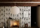
2. Inky Green
Since we are all on the rise of connecting to nature, inky green is emerging as a favourite. It’s rich, in-depth, and timeless that works well in both contemporary and traditional homes.
3. Brown
As mentioned earlier, earth-inspired colors such as browns are stepping into the spotlight, especially in interior decor. It’s not as heavy as black and offers the richness of burgundy without committing to a red palette.
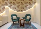
4. Powder Blue
Powder blue is believed to be a standout color for 2026 as it offers a more softer and expressive alternative to neutrals. It’s light, calming, and pairs together well with warmer tones for a grounded feel.
How to Choose the Right Color for Your Space?
With so many color trends and lucky colors for 2026, how do you even begin to choose the right color for your space? If you’re confused, let this small guide help:
1. Understand the Mood You Want to Create
Since we have already established that every color carries a feeling, choose the feeling that you want to create. Decide whether your space should feel relaxing, lively, cozy, or creative before picking a trendy shade.
Subscribe to Save 5%
All subscribers get an additional 5% OFF on their first order
2. Look at How Your Space is Used Daily
While your home might feel relevant if you jump on the color trends train, it is vitally important to understand which space needs which color. A bedroom needs a very different color than a living room or home office. So pick accordingly.
3. Pay Attention to Lighting
Tangerine disco might look cooler in a house with ample natural light but dull and flat in a room with minimal lighting. Therefore, it’s important to conduct a thorough light analysis to understand which trendy color suits your space the most.
4. Balance Color Trends with Timeless Appeal
It’s okay to love a trending color but use it wisely. If you’re unsure, bring trendy shades in your home through accent walls, decor, or soft furnishings instead of committing to them everywhere.
5. Let Your Personality Lead
Whether the trendy color is a color you’re naturally drawn to or one that aligns with your zodiac sign, personal connection matters. A color you love will always outshine one you choose just because it was ‘top color of the year.’
How These Colors Translate to Wallpapers & Murals
Who said trending colors in interior design only translate to wall paint colours and furniture? These colors can show up with texture, pattern, depth, and storytelling through wallpapers and murals. Here’s how these shades can come to life with Magicdecor’s wallpapers:
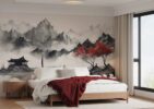
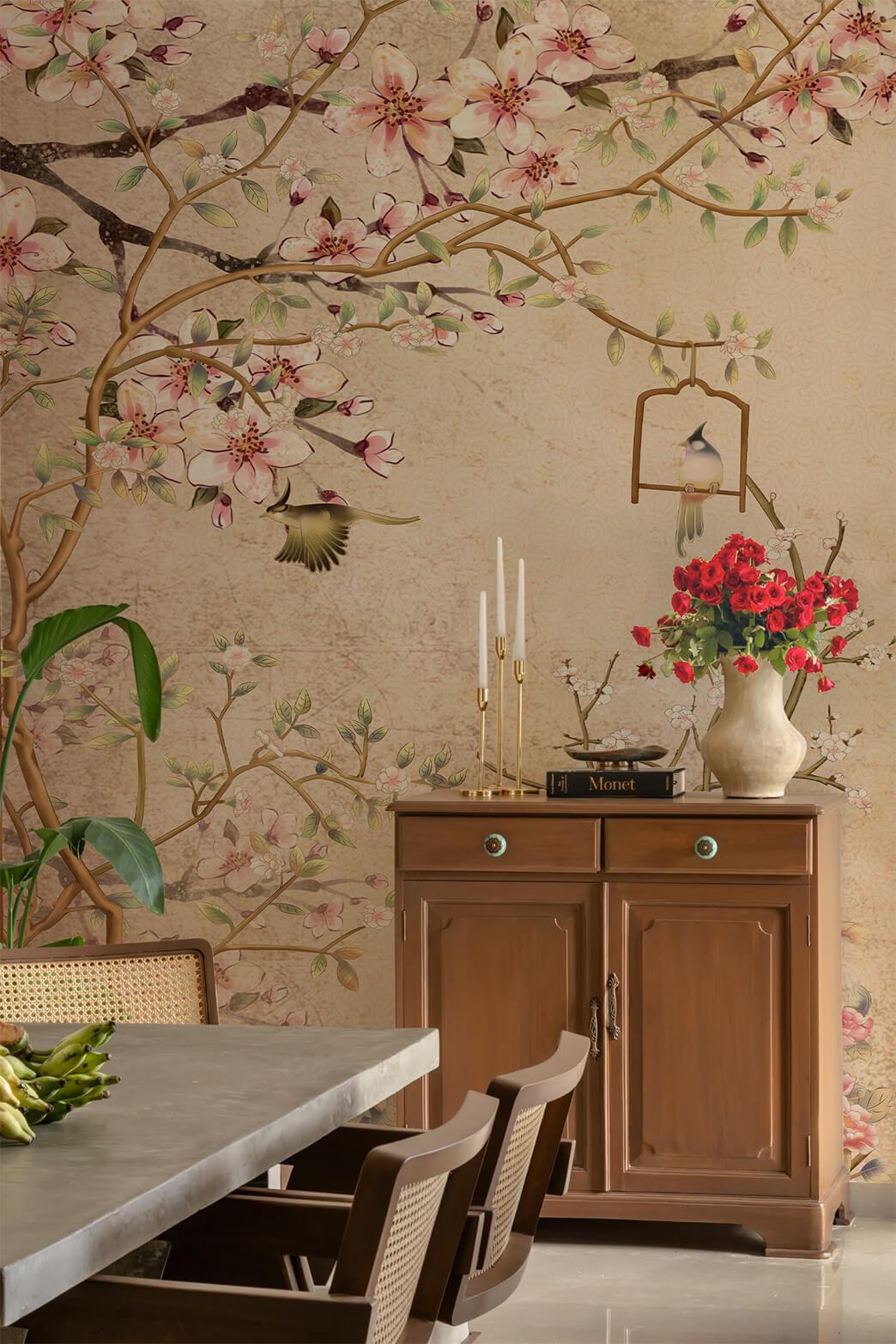
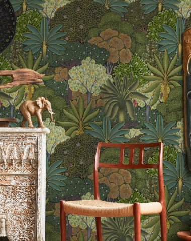
1. Earthy Shades Through Botanical Patterns
Shades inspired by nature— moss, clay, stone, water, can translate beautifully into wallpapers with botanical patterns. These designs add the tranquility and warmth of nature, making them ideal for living rooms and bedrooms.
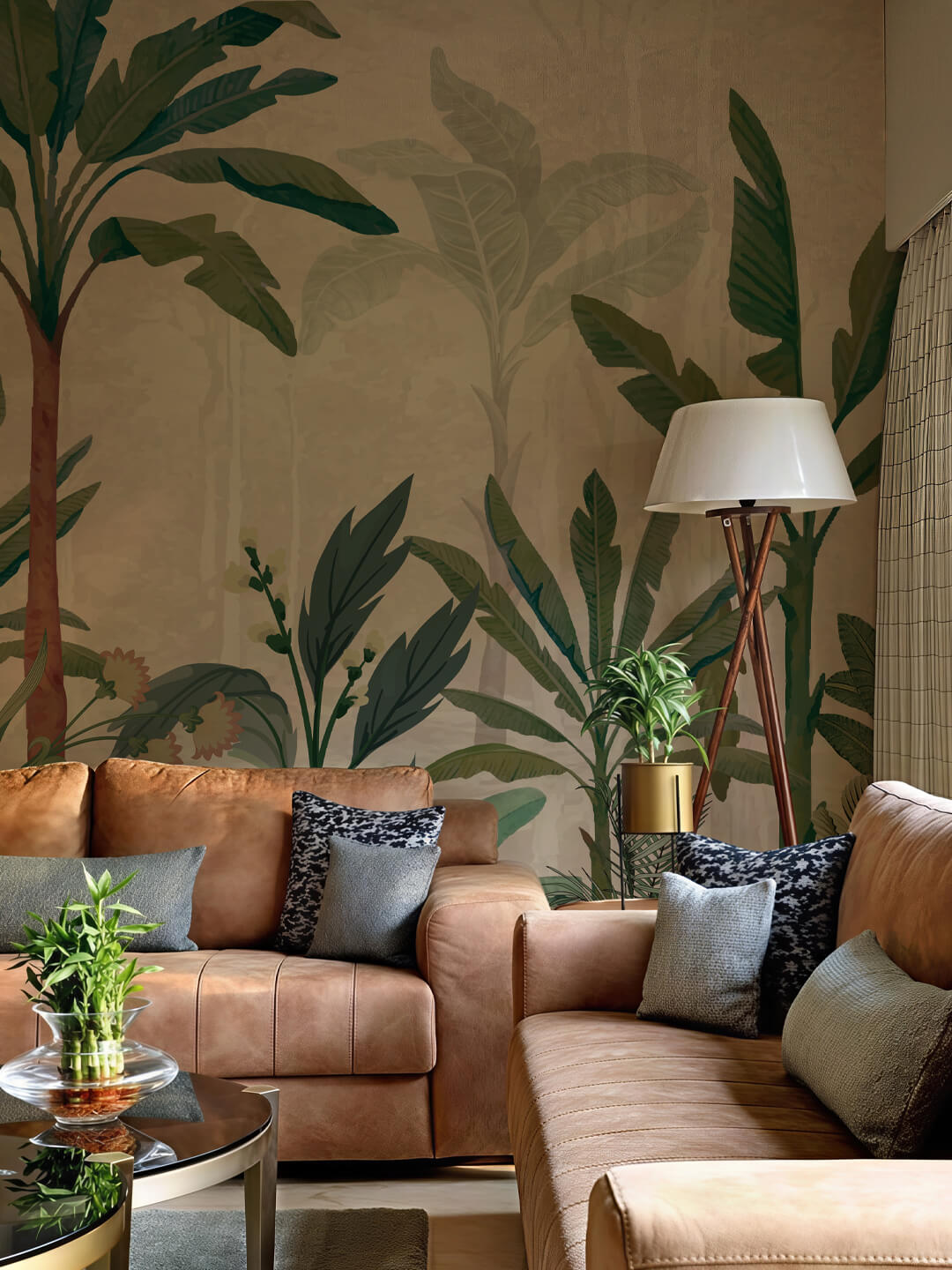
2. Rich, Bold Colors As Statement Walls
Instead of covering all four walls with one color, opt for one deep and rich color and style it as large-scale murals. This creates a stunning focal point while keeping the rest of the room visually and harmoniously balanced.
3. Color of the Year in Layered Textures
Style Pantone’s color of the year, Cloud Dancer, in subtle wallpaper textures like geometric prints or watercolor effect. This way, your home hops onto the trendy color while also exuding elegance.
4. Lucky Colors Woven into Meaningful Designs
If you plan to incorporate your lucky color in your home, you can find a way to incorporate them through symbolic and meaningful wallpapers such as culturally-inspired artwork or celestial motifs.
Letting Color Trends Inspire, Not Define Your Space
While many of us are ready to welcome trending shades and lucky colors into our wardrobes, products, and interiors, it’s worth remembering that trends don’t live in your space, you do.
Let these color palettes inspire, guide, and spark ideas to fit your lifestyle, routine, and home. Afterall, trends and color of the year may come and go, but a space that feels personal stays through.
FAQs
- What are the top color trends for 2026?
The top color trends for 2026 are earth-inspired shades, serene neutrals, rich and deep hues, vibrant and warm shades.
- What is the lucky color for 2026?
As per Feng Shui and Vedic science, blue is widely considered a lucky color for 2026, symbolizing calm, stability, and clarity.
- Can lucky colors and trendy colors work together in one space?
That depends on how thoughtfully you design the space. A lucky colour can be styled through furniture or meaningful decor while trendy colors can be used as wallpapers or murals.
- How can I adapt the trending colors to fit my space and personal style?
Start by choosing shades that naturally resonate with you, then adjust the intensity of the shade to match your space. No matter what trending color you chose, always let your personality and space lead.