Wabi-sabi design or botanical bespoke design?
Color contrast or color drenching?
Accent wall or all walls?
After answering these few questions, you’ve finally decided to go with wallpaper murals.
But then you’re faced with the single last crucial question, which is:
“How do I choose the right color palette for my wallpaper mural?”
We understand that it can be tiring and confusing to select a color palette for your wallpaper mural. To rescue you from home de-echo-r of confusion, here’s a blog to guide you through it!
There are five steps to figure out what color palette is best for your wallpaper mural!
1. Understand what a wallpaper mural is and its purpose:
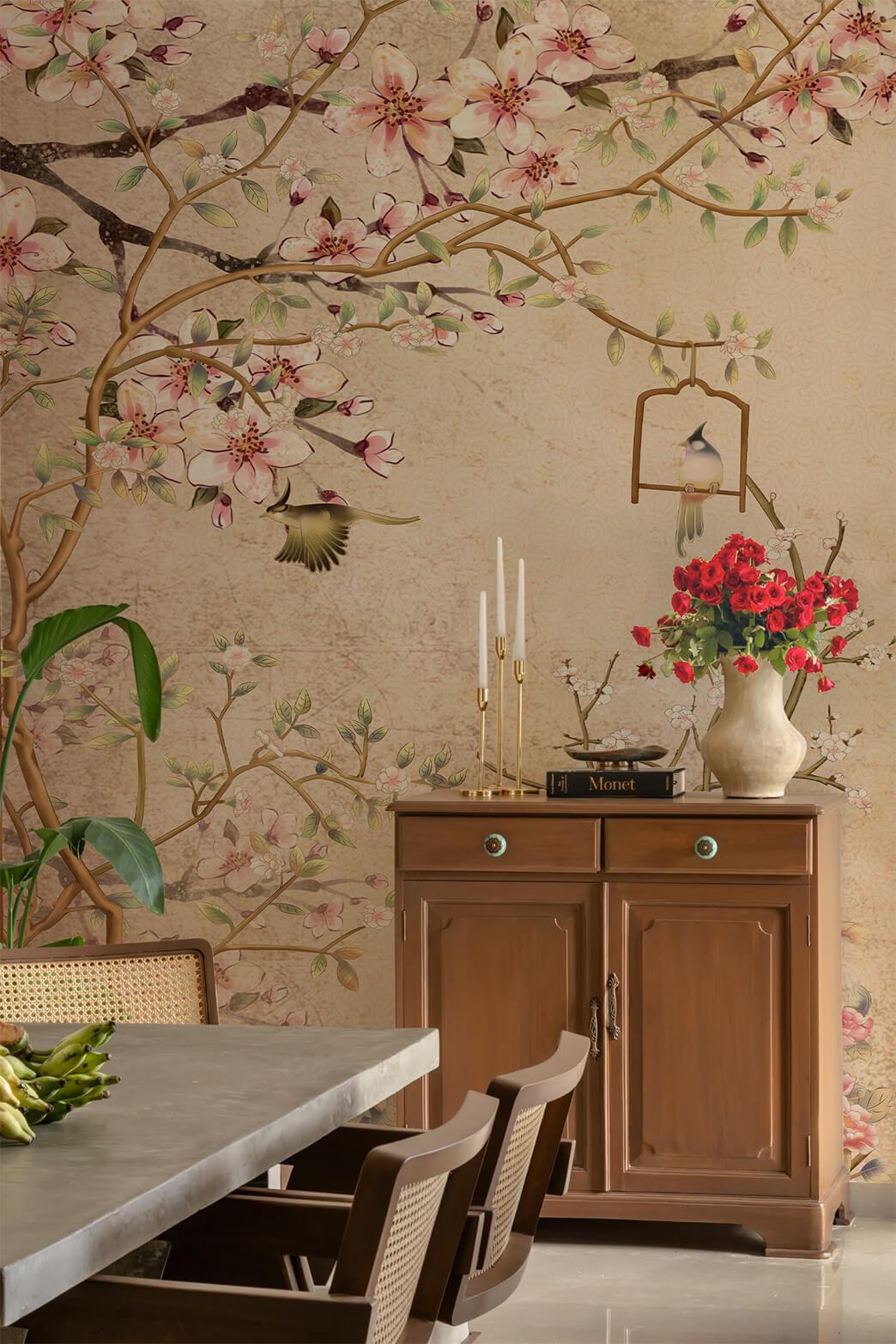
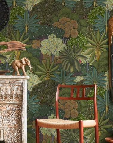
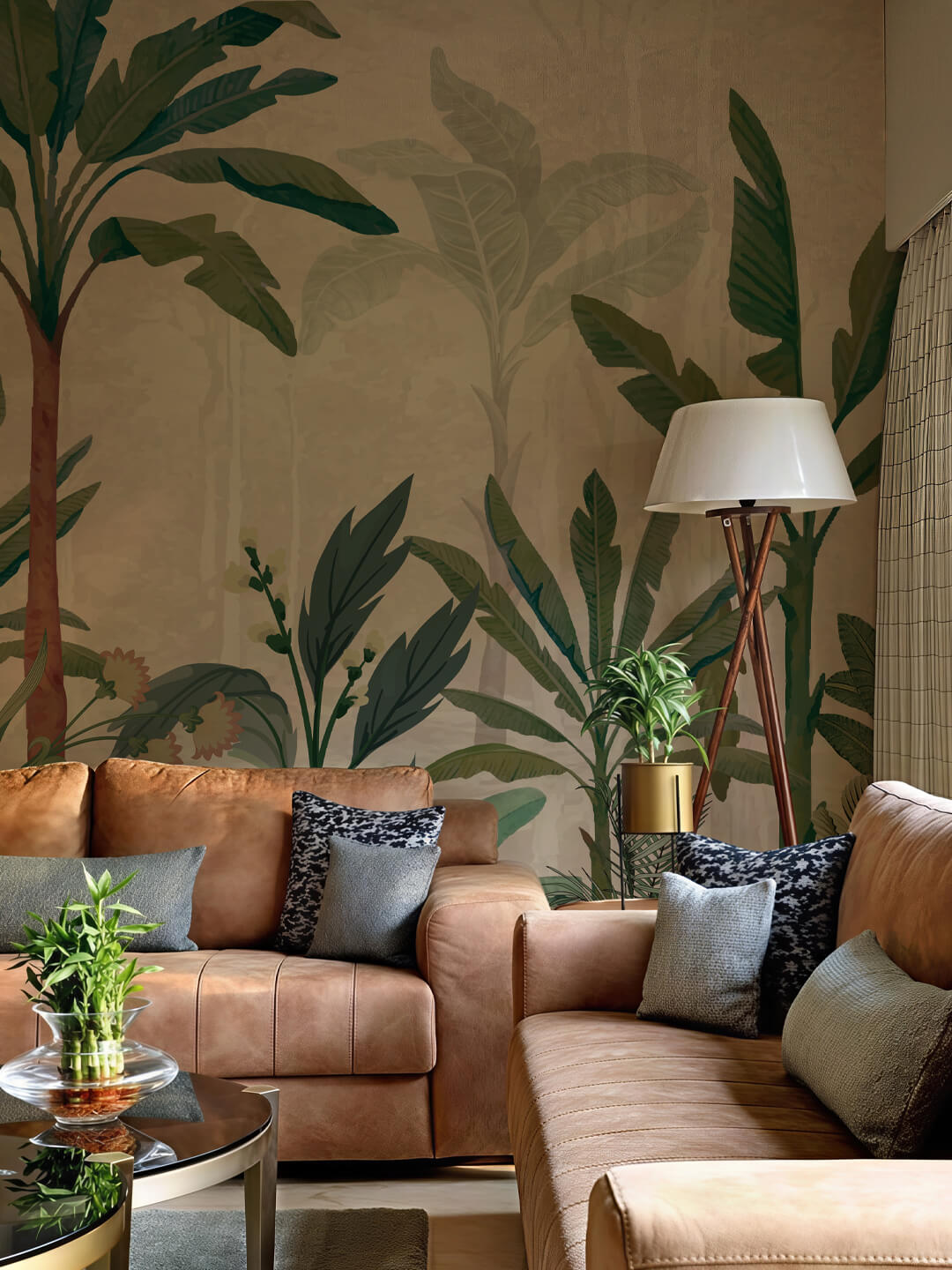
Wallpaper murals are usually large paintings-like designs used to create a dramatic statement.
When we say ‘wallpaper mural,’ it’s not just an ordinary wallpaper pattern but so much more! It’s a source that decides the mood of your space along with the color palette. Therefore, it’s ideal to think about the mood that you are going for.
For example, if you’re trying to achieve-
Tranquil mood: Subtle shades can be your strongest warrior.
Vibrant vibe: From bright yellows and oranges to fuchsia, pink can infuse this tone.
Luxurious tone: Metallic hues like golden and silver hues are excellent for conveying grandiosity.
2. Use tools to explore the trendy color palette or classy color palette:
Did you know that there are around 10 million shades of colors discovered yet? Imagine searching a color palette amongst. In scenarios such as, as we’ve got you covered- we found a secret gateway!
Your designs on your walls
Upload any image to order wall mural prints online
In today’s date, there’s a constant desire to keep up with the latest home decor and design trends. To solve this issue, there are plenty of websites that’ll suggest you the latest color palettes, color combinations, and even color contrasts.
Explore the options below to make your journey of finding a color palette easier:
- Coolors:
Talk about being dynamic because Coolors is definitely top on the list of being dynamic. It offers you a variety of trending palettes or even generates a color palette up to your taste.
- Color hunt:
Color Hunt is yet another awesome website to find fun color combinations for your wallpaper mural.
3. Check out the color wheel to find a color palette of your choice:
If you still can’t find the ideal color palette, the traditional way will never fail you! Without any delay, let’s get started-
- Is there any color that you like in particular but can’t really find its complementary, monochromatic, or contrasting shades? Don’t worry, and we’ve got your back.
- Select your favorite shade in the color wheel, then automatically get harmonious, monochromatic, complementary, analogous, triadic, or tetradic shades.
What’s the difference between these shades? Let me break it down for you.
- Harmonious shades: Shades that work well together.
- Complementary shades: Shades that are opposite each other in the color wheel, creating a contrast.
- Monochromatic shades: It refers to the variation of a single color.
- Analogous shades: They refer to the shades that are next to each other in the color wheel and share similar hues and contractions.
- Triadic shades: Shades that are spaced apart on the color wheel evenly and create a balanced look.
- Tetradic shades: It is a color scheme made using two pairs of complementary shades.
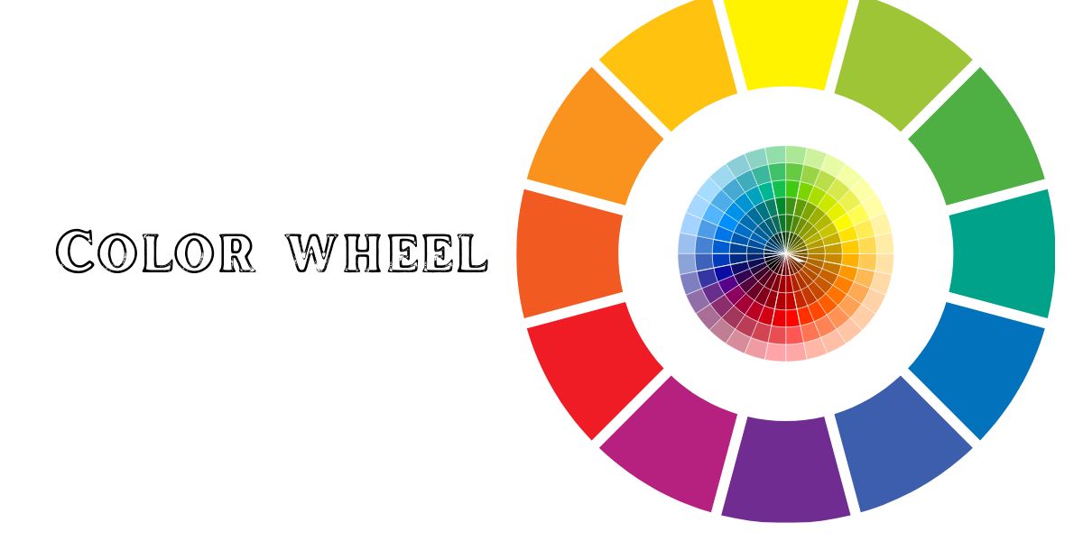
I assure you that by using these shades, you can surely find the color palette of your dreams!
Subscribe to Save 5%
All subscribers get an additional 5% OFF on their first order

4. Consider the lighting of the designated space:
Lighting can make an immense difference in a space, so it’s necessary to consider lighting before you make the final call on deciding on a color palette.
Artificial lighting:
Artificial lighting can effortlessly switch the vibe and how colors look in a designated space. Warm yellow lights can enhance red, orange, and yellow hues. In the case of white cool lighting, cool shades like blue and greens work extraordinarily well.
Natural Lightning:
Shades like rich, deep blue, and greens can enhance the natural lighting extremely well. The natural lighting will evoke the lush appeal of the colors of the murals.
It’s also important to consider how much lighting is on a wall reaches, it contributes majorly to selecting a color shade for your space. Bright colors are an excellent choice for darker space and vice versa!
5. Make sure it works well with your existing decor:
Last but not least, your home decor should complement the color palette of your wallpaper mural. Wallpaper mural designs are available in plenty of options; it’s crucial to go for a color palette that flows in your home decor backdrop.
Concluding everything that has been stated so far, colors are the life of a wallpaper- choose one that pleases your eyes and soul! Whether you aim to achieve a vibrant wallpaper mural or a serene transcending backdrop, wallpaper murals have become your best tool to bring your idea to walls!